Riley Gerszewski

Misalignment between design and development at STERIS led to inefficiencies, with mismatched components and communication gaps slowing progress across cross-functional teams.
React components did not match Figma designs, causing unnecessary rework.
Teams had varying levels of software development experience, leading to communication gaps.
Lack of shared terminology among designers, developers, BAs, PMs, and QA hindered collaboration.

Pitch to Senior Leadership
One of the key challenges was overcoming leadership’s perception that using templated components would make the product look generic or “cookie-cutter.” This concern was particularly strong because they associated pre-built components with lower quality.
To address this, I demonstrated how Design Tokens would allow us to update the styling progressively throughout the project, ensuring that by the time of launch, the product would align with our brand identity. By framing the design system as a scalable foundation rather than a static template, I was able to secure leadership’s approval and commitment.
Cross-Functional Support
I introduced Storybook to development managers, highlighting its role in bridging the gap between Figma designs and React implementations. We then formed a specialized cross-functional unit—one designer, one developer, and one QA lead—dedicated to aligning Figma components with Storybook and React.
Maintaining Alignment
To ensure a seamless rollout, we managed design system work just like any other development task. Each component was treated as a standalone DevOps ticket, ensuring clear ownership and tracking across teams. This approach:
Allowed developers, designers, and QA to collaborate on individual components without disrupting broader workflows.
Ensured that each component met both design and development requirements before being merged into the system.
Integrated design system work into existing sprint cycles, preventing delays or competing priorities.

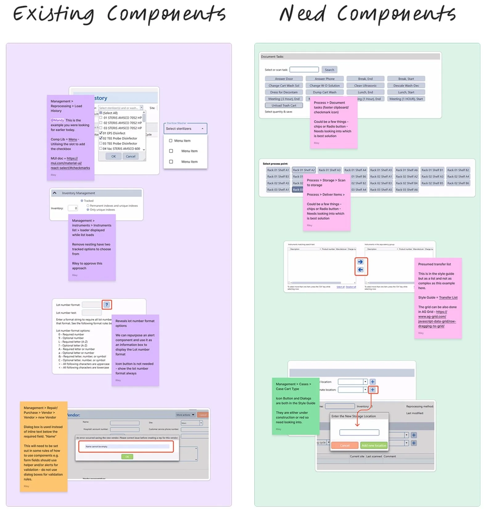
To establish a scalable design system, I led a comprehensive audit by capturing screenshots of every component used in the existing application. The team then cross-referenced these UI elements with Material UI components to assess alignment and identify any gaps. Prioritization was key—I focused on components that had the most immediate impact while omitting unnecessary elements that weren’t relevant to our application. Additionally, I identified and documented custom components unique to our platform, ensuring seamless integration into the new system without adding unnecessary complexity.
This structured approach allowed us to move quickly without overcomplicating the process, ensuring that we built a design system tailored to our needs rather than adopting a one-size-fits-all solution.
To ensure efficiency and scalability, we structured our Figma files into distinct sections:

Component Library – Designers used the Material UI for Figma component file as a foundation. Components were made available first and later updated with the correct styles and design tokens as the project progressed.
Style Guide – A centralized reference for components, typography, spacing, colors, and interaction patterns, ensuring consistency across projects.
Individual Project Files – Dedicated Figma files for each project allowed teams to implement the standardized components while still accommodating unique project needs.
It took a total of 8 months to successfully secure Figma within a Regulated Enterprise environment. This process involved various stages of assessment and compliance to ensure that all necessary regulations were met.
Overcame compliance challenges by partnering with Legal, HR, IT, and Security.
Advocated Figma’s value, influencing adoption beyond my business unit.
I ensured Figma became the default design tool for STERIS product development
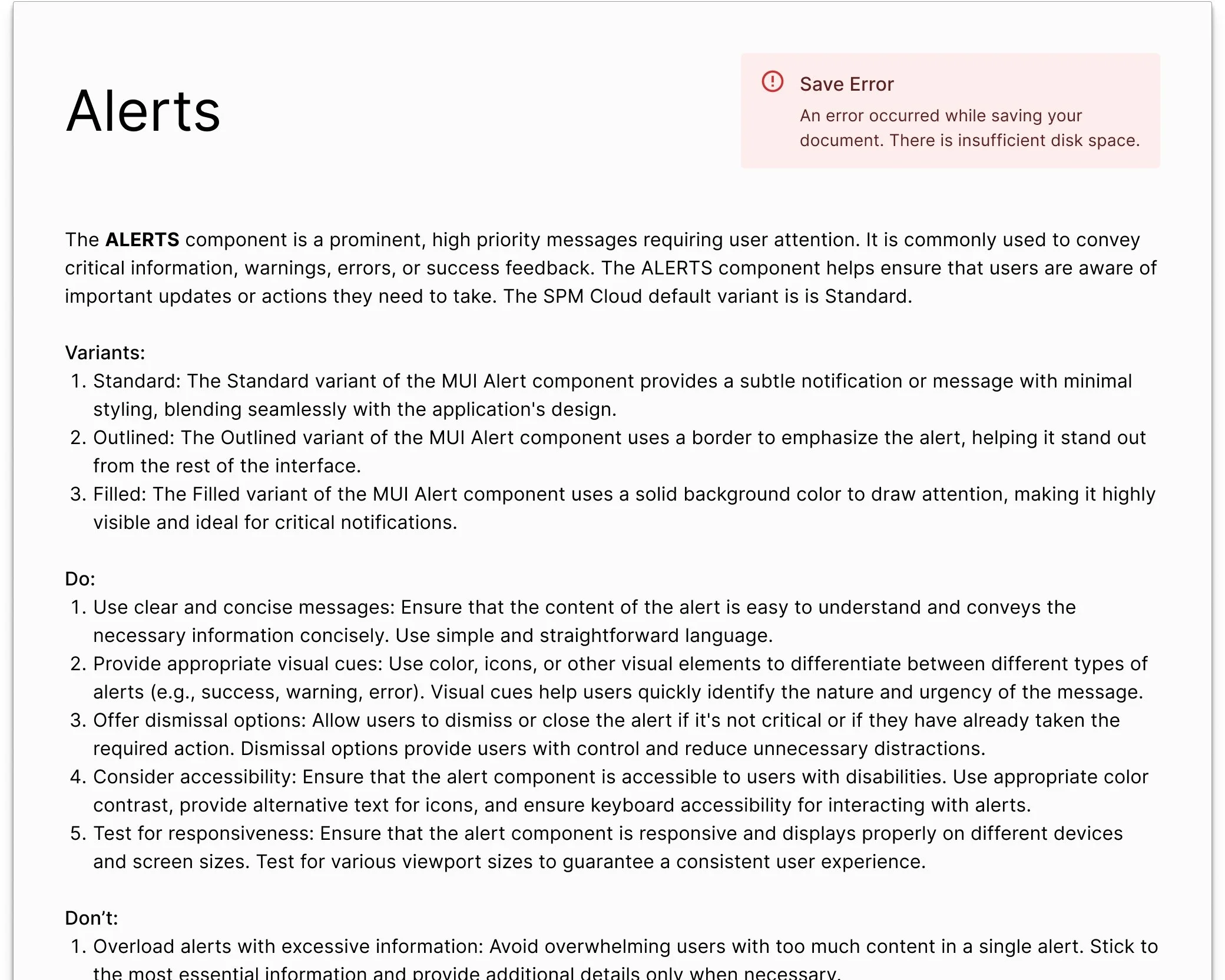
To accelerate documentation and ensure consistency, I used LLMs and Generative AI to generate structured guidelines for each component. Working with MUI design components in a React-based environment, the AI provided:
A high-level overview of each component’s function
Five best practices (Do’s and Don’ts) for its usage
Suggested alternatives when a different component might be more appropriate


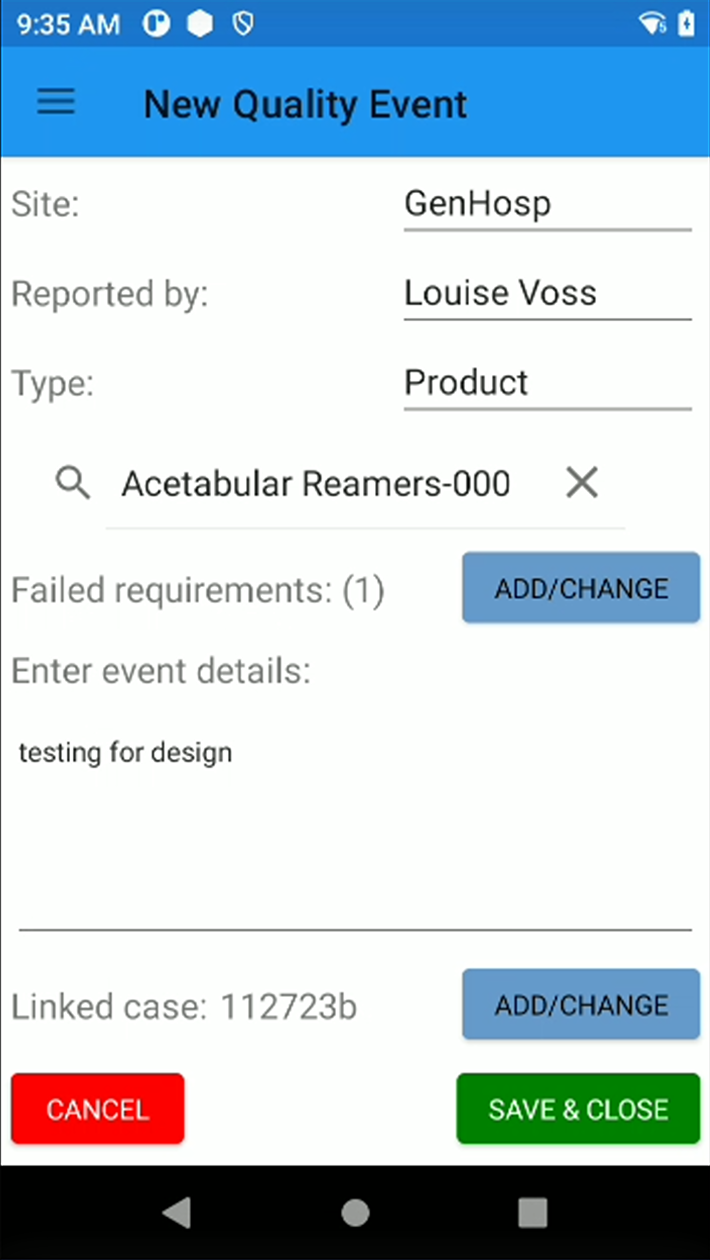
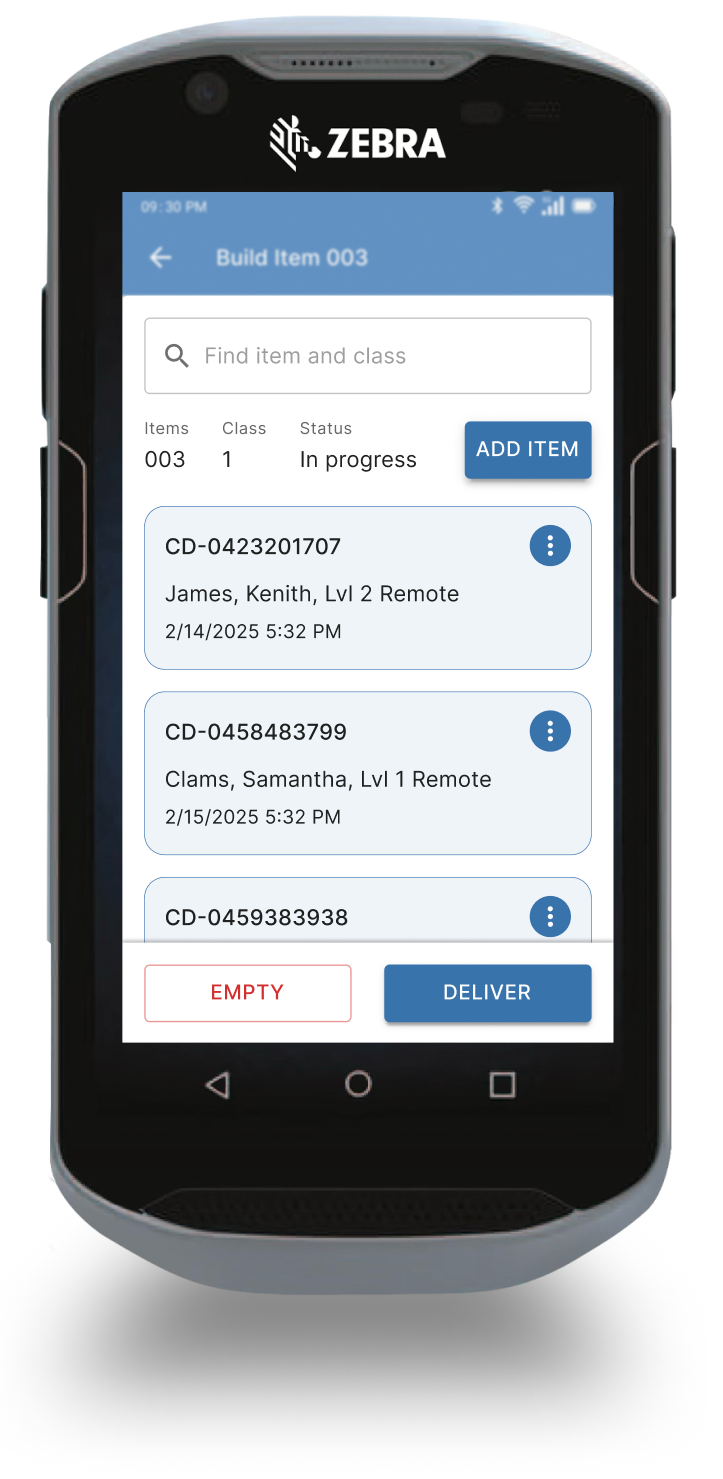
After establishing the initial design system, we faced an unexpected pivot—from a SaaS platform to a mobile app. This shift required us to adapt the system for handheld devices while maintaining consistency. Fortunately, Material UI's foundation in Google Material Design meant that many existing components were already optimized for mobile. Our primary focus became identifying and integrating unique components that weren’t inherently mobile-friendly.

Applying the same approach as before, we conducted a component audit by capturing screenshots of the existing mobile app to determine what needed to be included. Despite the sudden shift, having a well-defined component library allowed us to begin mobile design work immediately. Our workflow remained agile, delivering work just in time—initially two sprints ahead, then gaining momentum to extend further as the project progressed.

50% Reduction in Design Production Time
Centralizing UI components sped up our design cycles and freed up bandwidth, delaying the need for more design hires.
Enhanced Development Velocity
Developers spent less time reworking UI details, allowing them to focus on more complex tasks.
Broader Adoption
Another STERIS project later adopted the design system and reported a decrease in dev time, confirming the system’s value beyond the initial scope. Furthermore, other business units began expressing interest in how they could potentially adopt the design system.
Collaboration & Education
Some team members were initially skeptical or unclear on the benefits. Frequent demos, open Q&A sessions, and hands-on training helped them see how consistency actually reduced their workload and improved final product quality.
By championing a scalable design system, I helped STERIS achieve faster development cycles, minimize rework, and nurture a culture of collaborative design. This approach has laid the foundation for ongoing improvements, enabling multiple teams to benefit from consistent, high-quality components without reinventing the wheel for every new project.